cheatsheet
https://deeplearning.fr/wp-content/uploads/2020/12/0_Cfo6qfxirL4STHTY1.png
https://martinnormark.com/a-simple-cheat-sheet-for-seaborn-data-visualization-2/
A simple cheat sheet for Seaborn Data Visualization
Just gonna put this out here, courtesy of Kaggle's Data Visualization course [https://www.kaggle.com/learn/data-visualization]. It is a super simple description of the different plots you can do with Seaborn [https://seaborn.pydata.org/], simply divided in
martinnormark.com
https://www.python-graph-gallery.com/all-charts/
All Charts | The Python Graph Gallery
A list of more than 300 charts made with Python, coming together with code and explanation
www.python-graph-gallery.com
Matplotlib
figure가 기본 자료 구조.
먼저 figure로 객체를 생성한 후 subplot(서브그래프),legend(범례),title을 설정
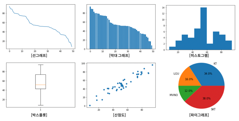
- 선그래프(line): 시간에 따라 연속적으로 변하는 데이터.
- 수직 막대그래프(bar): 시간에 따라 연속적으로 변하되, 각 변화를 명확히 나타내야 하는 데이터를 표현하기 적합
- 히스토그램(hist): 데이터 집단이 갖고 있는 분포를 표현하기 적합
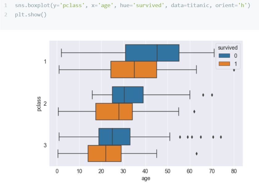
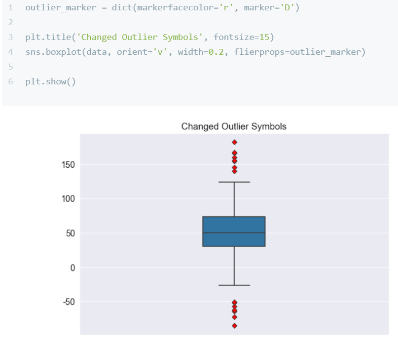
- 박스플롯(box): 데이터가 갖고 있는 분포를 사분위수로 표현
- 산점도(scartter): 각 데이터를 x축과 y축을 기준으로 점으로 나타냄. 데이터 간 관계를 표현하기 적합합니다.
- 파이그래프(pie): 데이터를 100%를 기준으로 각 비중만큼 표현
# matplotlib.pyplot을 plt이름으로 호출하기
import matplotlib.pyplot as plt

# 무역수지 열값 기준으로  내림차순으로 정렬하기
trade = trade.sort_values(by=['무역수지'], ascending=False)
# 인덱스 정렬
trade= trade.reset_index(drop=True)
trade
1. 선그래프

2. 수직 막대 그래프

3. 박스 플롯

4. 산점도
5. 파이그래프
Seaborn
Matplotlib에 비해 다양한 색상 테마와 통계용 차트를 제공


- 조인트 플롯(Joint Plot)
산점도와 히스토그램을 함께 표현. 두 데이터 간의 관계를 표현하기 적합 - 박스 플롯(Box Plot)
박스 플롯은 데이터가 갖고 있는 분포를 사분위수로 표현 - 막대 그래프(Bar Plot)
막대 그래프는 각 데이터를 막대(bar)로 표현 - 회귀 선(Regression Line)
회귀분석을 통한 두 데이터 간의 관계를 표현 - 히스토그램(Histogram)
히스토그램은 데이터 집단이 갖고 있는 분포를 표현하기 적합 - 히트맵(Heatmap)
상관분석을 통한 두 데이터 간의 관계(상관관계)를 표현 색이 짙을 수록 두 데이터는 상호 관련성이 높음. - 카운트플롯(Countplot)
- 열별 value를 count하여 그래프에 숫자로 써서 보여줌
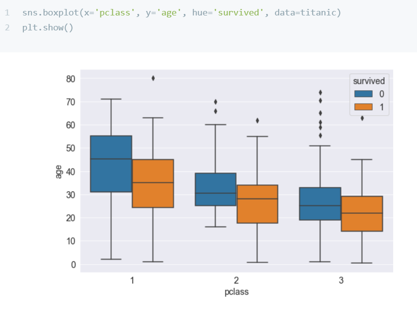
# Boxplot 그리기
sns.boxplot(data=customer_sample, x='Class', y='HP')
https://dacon.io/en/codeshare/4389
iris, tips..데이터셋 말고 진짜 기능은 시각화! seaborn으로 시각화🧐(2)
dacon.io
https://hyemin-kim.github.io/2020/07/03/S-Python-Seaborn1/
'Study (Data Science) > ML' 카테고리의 다른 글
| CSV, XML, JSON (0) | 2022.12.08 |
|---|---|
| 문자열다루기, 정규표현식 (0) | 2022.12.08 |
| Scikit-Learn (0) | 2022.12.07 |
| 알고리즘 선택하기 (0) | 2022.12.07 |
| 오차행렬, FP, FN, F-score, Threshold (0) | 2022.12.07 |


댓글